At Artsaisle, we believe your walls deserve more than just decoration, they deserve a story that feels like you. Colour is the secret thread that ties it all together, transforming a room from “nice” into something deeply personal.
If you’ve ever wondered how to pick the perfect artwork for your space, one of the best places to start is the colours already living in your home. Whether you’ve just painted a fresh feature wall or you’re working with an existing palette, the art you choose can either harmonise, contrast, or boldly steal the show.
Today, we’ll help you navigate how to select art based on your home’s colour palette, creating a space that not only looks beautiful—but feels beautiful.
Start with Your Existing Colour Palette
Look around your space.
- What colours dominate your walls, furniture, rugs, or curtains?
- Are they soft and subtle, or bold and vibrant?
- Do you see mostly warm tones (reds, oranges, yellows) or cool tones (blues, greens, purples)?
Your existing palette is your starting point. You don’t necessarily have to match art perfectly to your wall colour, but being aware of your room’s base tones will help you choose art that either blends seamlessly or makes an intentional statement.
Ask: Do You Want Harmony or Drama?
Here’s where things get exciting. Choosing art isn’t just about matching colours, it’s about choosing a mood.
Option 1: Harmonise
- If your walls are soft sage green, art with gentle greens, dusty pinks, or warm neutrals will create a soothing, unified look.
- A space full of neutrals like beiges and soft greys pairs beautifully with abstract art in subtle earth tones or monochromatic palettes.
Option 2: Create Contrast
- Deep navy walls look stunning with vibrant mustard yellows or warm rust-coloured abstracts.
- Bright white walls give you a blank canvas to showcase bold, multi-coloured art.
Interactive Check-In:
Which speaks to you more right now?
⬜ Calm and cohesive vibes
⬜ A bold statement piece that pops
Drop your answer in the comments—we’d love to help you find art that matches your vision.
Think About Room Function
Different rooms call for different energies. Let’s match art and colour to how you use the space.
Living Room: The Heart of the Home
- Want cozy and inviting? Pick art that echoes your wall tones for gentle flow.
- Love a gallery wall? Mix small art pieces in varied colours but keep one or two consistent hues to tie it all together.
Bedroom: Your Retreat
- Soft, muted colours are ideal if you want relaxation.
- Prefer personality? Choose one bold piece above the bed—but in a colour that doesn’t fight your wall shade.
Dining Room: Connection & Conversation
- Warm colours like reds and oranges encourage connection.
- Dark walls? Choose lighter artwork to avoid a heavy feel.
Home Office: Focus & Creativity
- Cool tones like greens and blues support concentration.
- Use bright art sparingly for small pops of energy.
Observe Undertones
Here’s a subtle tip many people miss: every paint colour has undertones. A grey wall might lean blue, green, or even purple.
Quick Test:
Hold a white piece of paper next to your wall. What subtle colour emerges?
Knowing your undertones helps you avoid choosing art that accidentally clashes. For instance, cool-toned art on a warm beige wall might feel slightly “off,” even if they’re both neutrals.
Let Art Be Your Colour Bridge
One of our favourite design secrets at Artsaisle is using art to connect different colours in your space.
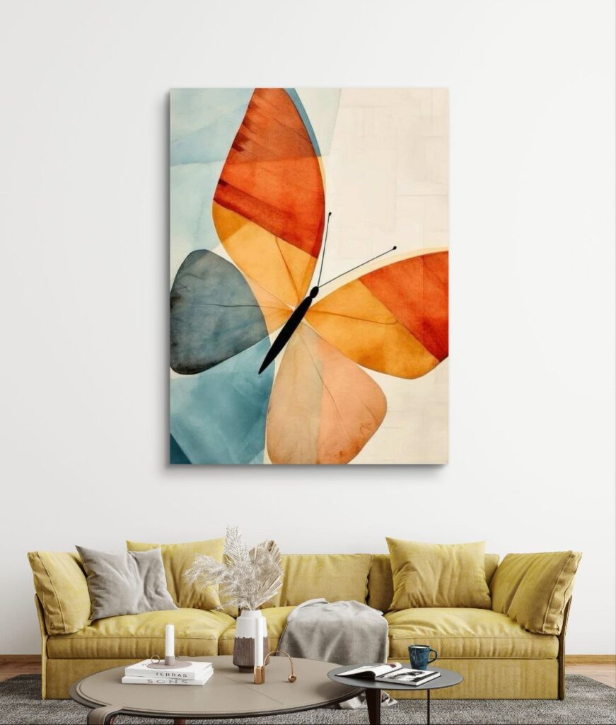
Imagine you have a living room with neutral walls and a bold teal sofa. A piece of abstract art that blends teal, gold, and soft cream can:
- Echo your sofa’s colour
- Introduce gentle warmth from gold
- Tie in your neutral wall shade
This creates visual unity without feeling matchy-matchy.
Try This Interactive Exercise:
- Pick one bold colour in your room.
- Search for art that includes that colour plus at least one new hue.
- Notice how it creates flow and interest!
Go Monochrome for Sophistication
Monochrome artwork created with variations of a single colour, is an elegant way to keep your space sophisticated.
- A navy room with abstract navy artwork in lighter and darker shades feels modern and luxurious.
- Soft blush walls paired with blush-toned abstract pieces look romantic yet modern.
Monochrome doesn’t mean boring—it’s all about texture and depth.
Don’t Forget Scale & Proportion
Colour matters—but so does size.
- Small art pieces might get lost on large, boldly coloured walls.
- Oversized art can feel overpowering in tiny rooms, especially if it contrasts dramatically with your wall colour.
Quick Tip:
A good rule of thumb is for your art to cover around two-thirds to three-quarters of the wall space above furniture.
Always Test Before You Commit
Before buying, test how your chosen artwork looks in your space:
- Print out a photo of the art and tape it to the wall.
- Use AR apps to visualise how art fits with your wall colour and furniture.
- View the art during different times of day to see how colours shift in changing light.
This simple step can save you disappointment—and ensure your art feels right at home.
Make It Personal
Rules aside, the art you choose should speak to you. Trends come and go, but your emotional connection to a piece is forever.
Ask yourself:
- Does this artwork make me feel calm, joyful, inspired, or reflective?
- Does it remind me of a memory or place I love?
- Do the colours feel like my personality?
At ArtsAisle, we believe every piece of art should be a window into your unique story. Let colour be your guide—but always let your heart have the final say.
Because your home deserves to feel like yours.
Bringing It All Together
Here’s your quick guide for choosing art based on your room’s colours:
✅ Identify your existing colour palette
✅ Decide if you want harmony or contrast
✅ Match art to the room’s purpose
✅ Check undertones
✅ Use art to connect colours
✅ Explore monochrome for elegance
✅ Consider scale and size
✅ Test before you commit
✅ Choose what feels personal and true
At Artsaisle, we’re passionate about helping you discover art that transforms your walls and tells your story through colour. Explore our latest collections and find art that feels like home.
Ready to let your colours speak? Explore our art collections.
